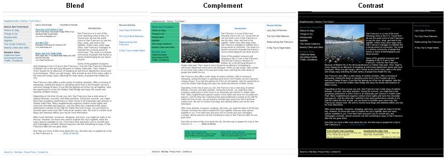
Three methods of optimising your AdSense colour palette - blending, complementing and contrasting. Blending is recommended in most cases.
These techniques can be used to minimise 'ad blindness', which is the tendency of users to ignore anything separate to the main content of the site. Ideally we want users to see and read the ads and click on those that they find interesting. It is the flow of text is crucial - someone is more likely to click on an ad because of what it says rather than the colour it is.
Many people think that blending is the most effective method. Blending works better than contrasting because the it maintains the flow of text on the webpage. Blending also gives the impression that the ad link in an integral part of the webpage, thus reducing the ad blindness factor. Contrasting colours will undoubtedly make your ads stand out better on the page, but this mean someone is going to make a conscious decision to click an ad because it is a pretty colour!
For best results blend ads to match the background colour of your webpage. In particular:
- The background colour and border of the ad match the background colour of the webpage.
- The colour of the ad link matches the other links on the webpage.
- The colour of the ad title and advertiser URL match the normal text colour on the webpage.
2 comments:
I just wanted to make a quick comment about ad blindness - there's a theory out there (that I kind of support, to be honest) that returning visitors tend to develop ad blindness faster than new ones. After all, these people have been visiting your blog for a while, they know its layout, they know that there's an AdSense skyscraper out there, and, let's face it, they're coming back for content, not to click on your ads.
That's why it's probably a good idea to occasionally either change the placement of your AdSense banners or to at least change the colours to make them stand out more. In fact, you could argue that contrasting might work best for grabbing the attention of returning visitors.
It's funny how returning visitors - often considered to be the backbone of a successful revenue-generating website - can be both a blessing and a curse insofar as ads are concerned.
Thank you for your comments George. I've read a little about ad blindness myself and it certainly seems to have a big influence over AdSense revenue. I'll try and write a post dedicated to ad blindness in the future.
Post a Comment